Istya is a young startup based in Paris Station F offering solutions to indoor air pollution.
They have designed a physical sensor and software which displayed data from the sensor and tips for bad air quality.
Istya is currently redesigning its software for air quality sensors. For this purpose, they needed the dashboard to be redesigned to ensure that current software users have a complete understanding of sensor information. They also wanted to rethink the recommendation pages of their different health tips. They were interested in the approach of a UX designer to do so, this is where I came in. I’ve worked for 2 weeks to understand Istya users and come up with a solution that would meet their needs.
Team: CEO of Company, Backend and front end dev, data scientist, myself as a UX/UI Designer and physical designer of sensor
Problem statement
People not experts in air quality need an easier way to understand the dashboard and suggestions about air quality improvement because the current dashboard is not clear enough to convey air quality ratings and to provide guidelines when air quality is bad
Constraints :
Focus only on the Dashboard and recommendations section
Desktop first approach
Keep the existing Logo and colour of the software
Design should be in line with the data analytics features of the software
Research
Current target customer: offices and factories who want to improve their air quality and reduce their energy consumption
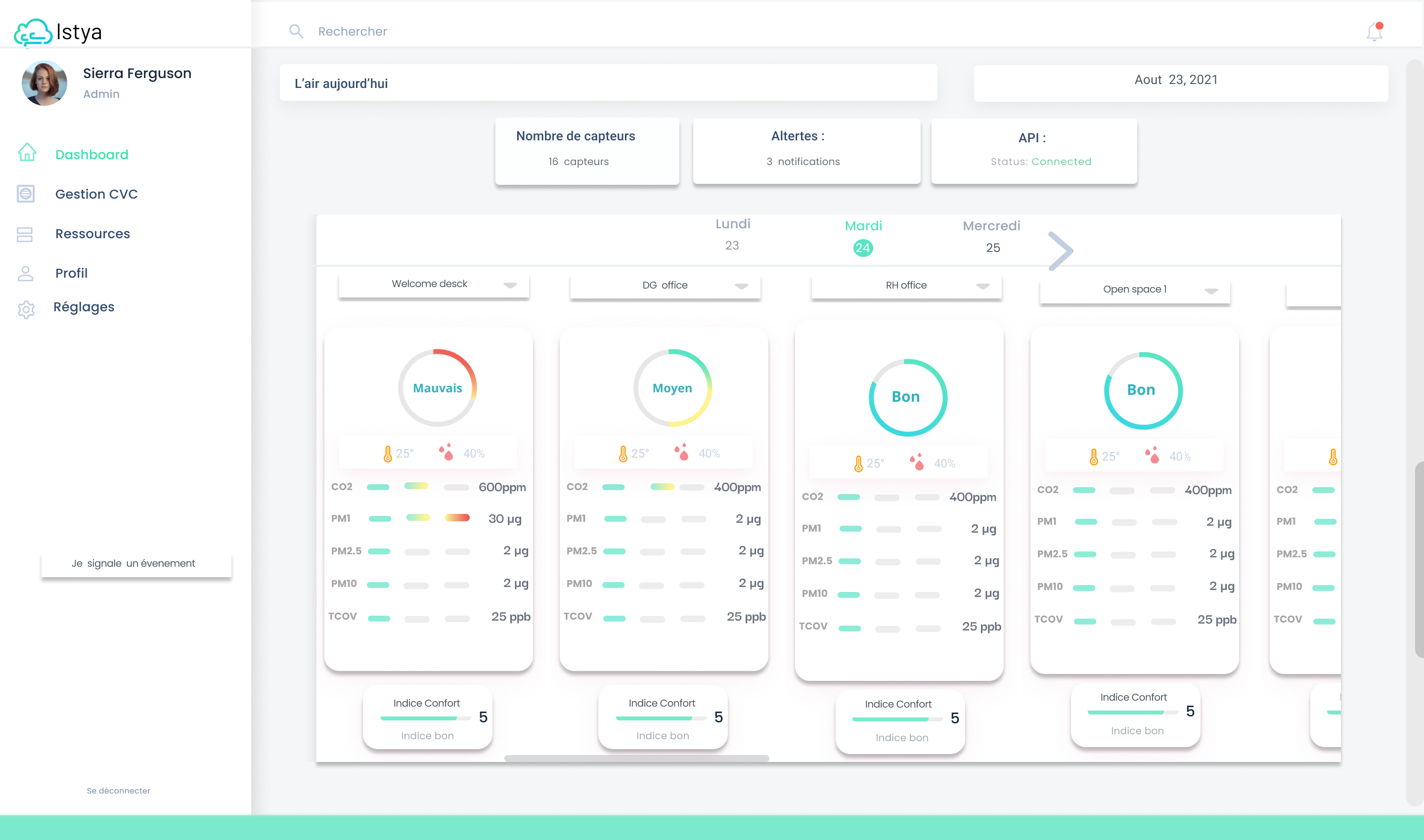
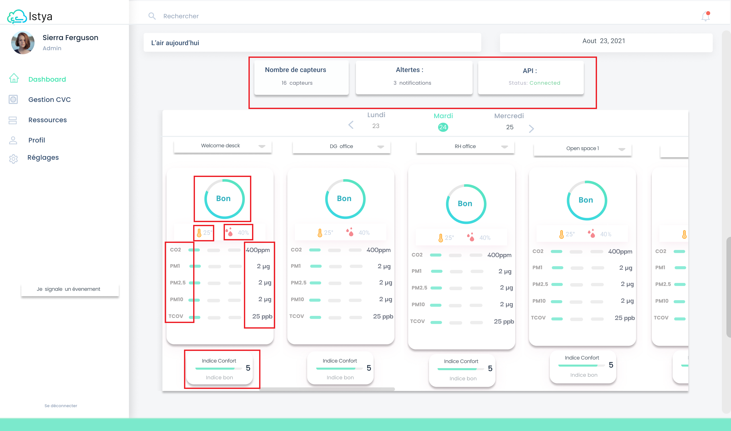
Istya Current Dashboard
Insights from Client meeting
To start the project, I organized a kick-off meeting with my client and made a list ofquestionsthat I wanted to ask them
They want to redesign their current dashboard so that it will be easy to use for their current customers
They also want to strengthen its brand image and generate new leads
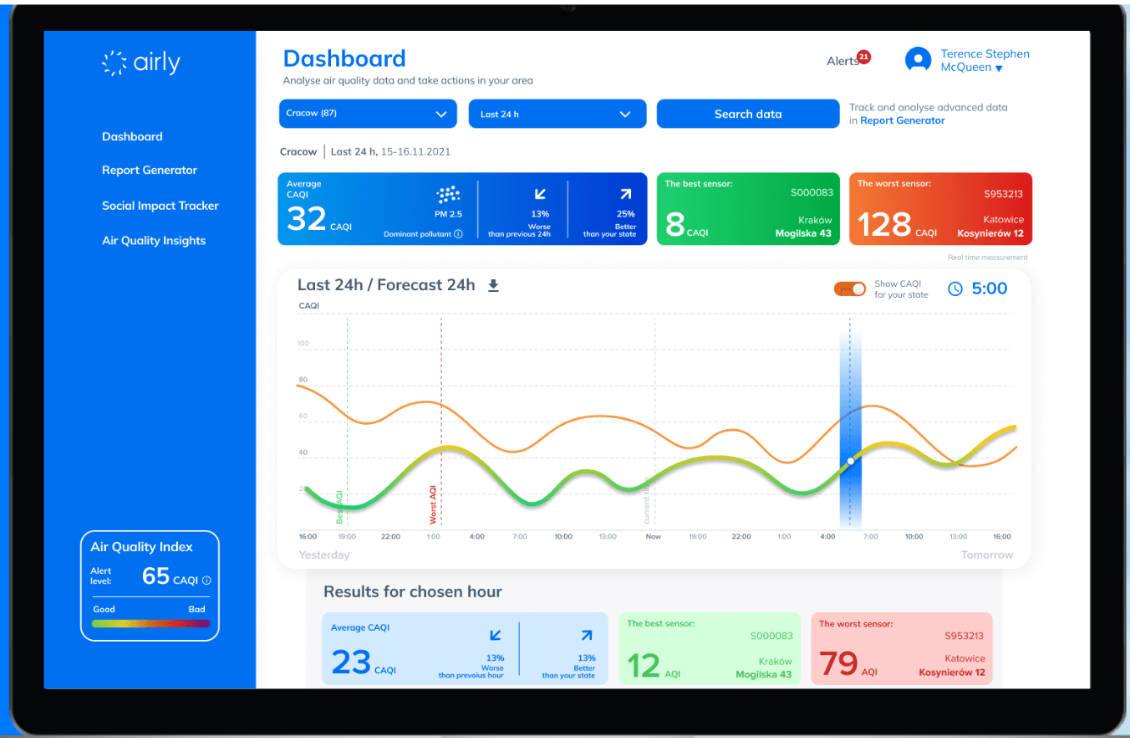
Competitors analysis
Airly Dashboard
Insights from Competitors Analysis
Problems being solved :
These websites / apps help users collect information on indoor air quality
Problems being ignored :
Some Dashboards Look a lot like weather reports
User is bombarded with a lot of information
Lack of next steps : advices on what to do next when air quality is bad
User interviews
I did 3 in-depth user interviews which got me below insights
“I understand that, they want to help in air pollution , but I do not understand their application.”
Quote from Istya user
User Pain points
Sensor application is overwhelming
Could not understand the rating for the air
Confuse about what to do when air quality is bad
User goals
To check the air quality of the surroundings
To work productively
Not fall sick often
Insights from Heuristic analysis
Current Istya Dashboard
The status given by the software were not very clear to the user
Icons do not have any names
User is not guided for any next action
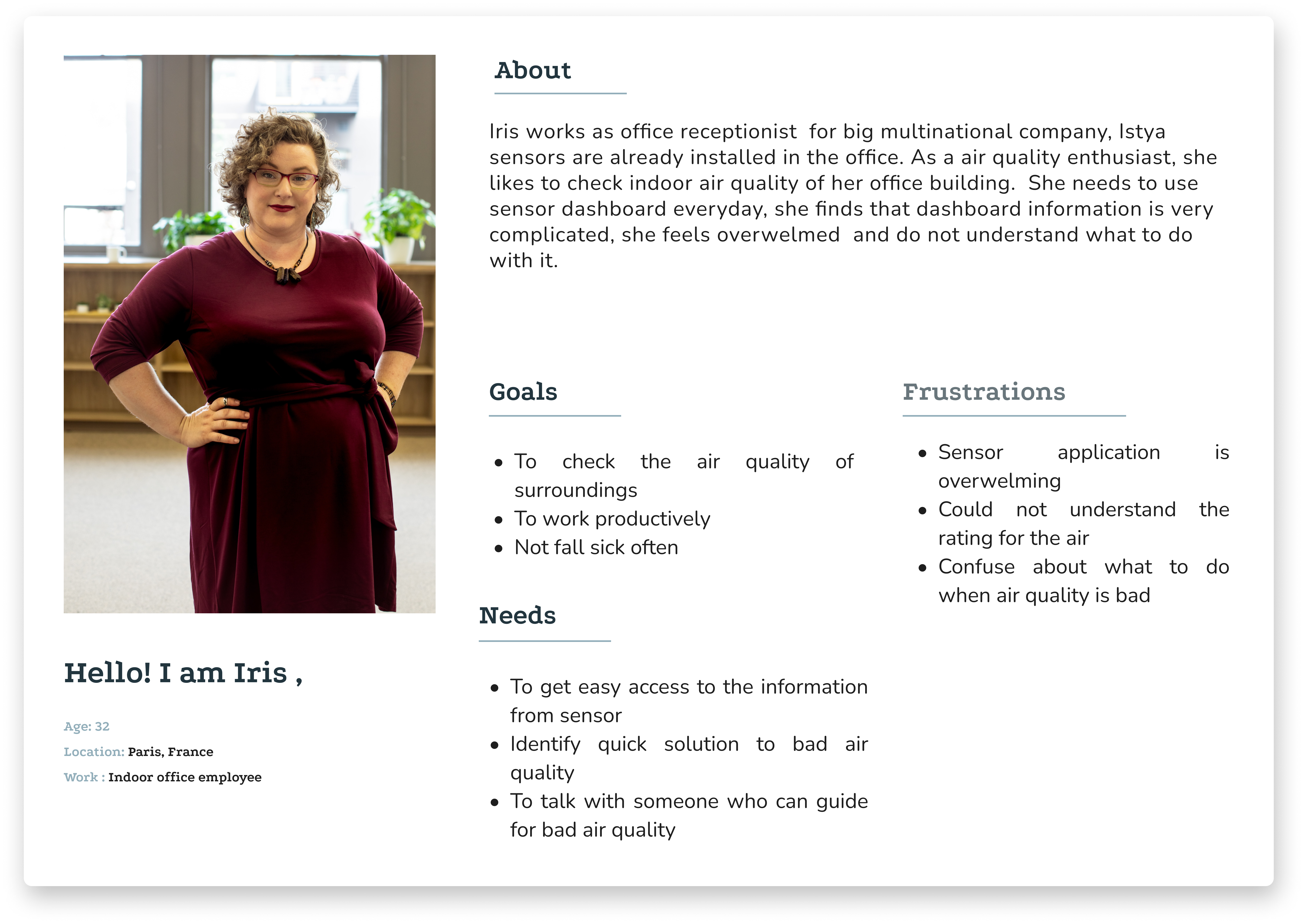
User Persona
Istya founder had said his biggest customer base is Factory and office managers people who are interested in improving their employees health by improving air quality
On the contrary, from user interviews and the usability testing what came out was, that actual users of Istya software are mainly office receptionists and they have very little to no knowledge of the air quality index
I referred to this persona from time to time while taking important design decisions
User Persona
Problem statement
People not experts in air quality need an easier way to understand the dashboard and suggestions about air quality improvement because the current dashboard is not clear enough to convey air quality ratings and to provide guidelines when air quality is bad
Agile Methodology
I began the design process by defining and prioritizing requirements using Agile development methods, defining use cases, writing user stories and elaborating on features for the MVP version of the app while at the same time documenting the roadmap of intended features. I believe it’s important in product planning to be cognizant of roadmap features to avoid designing user experience solutions that do not scale and enable adaptation when requirements change.
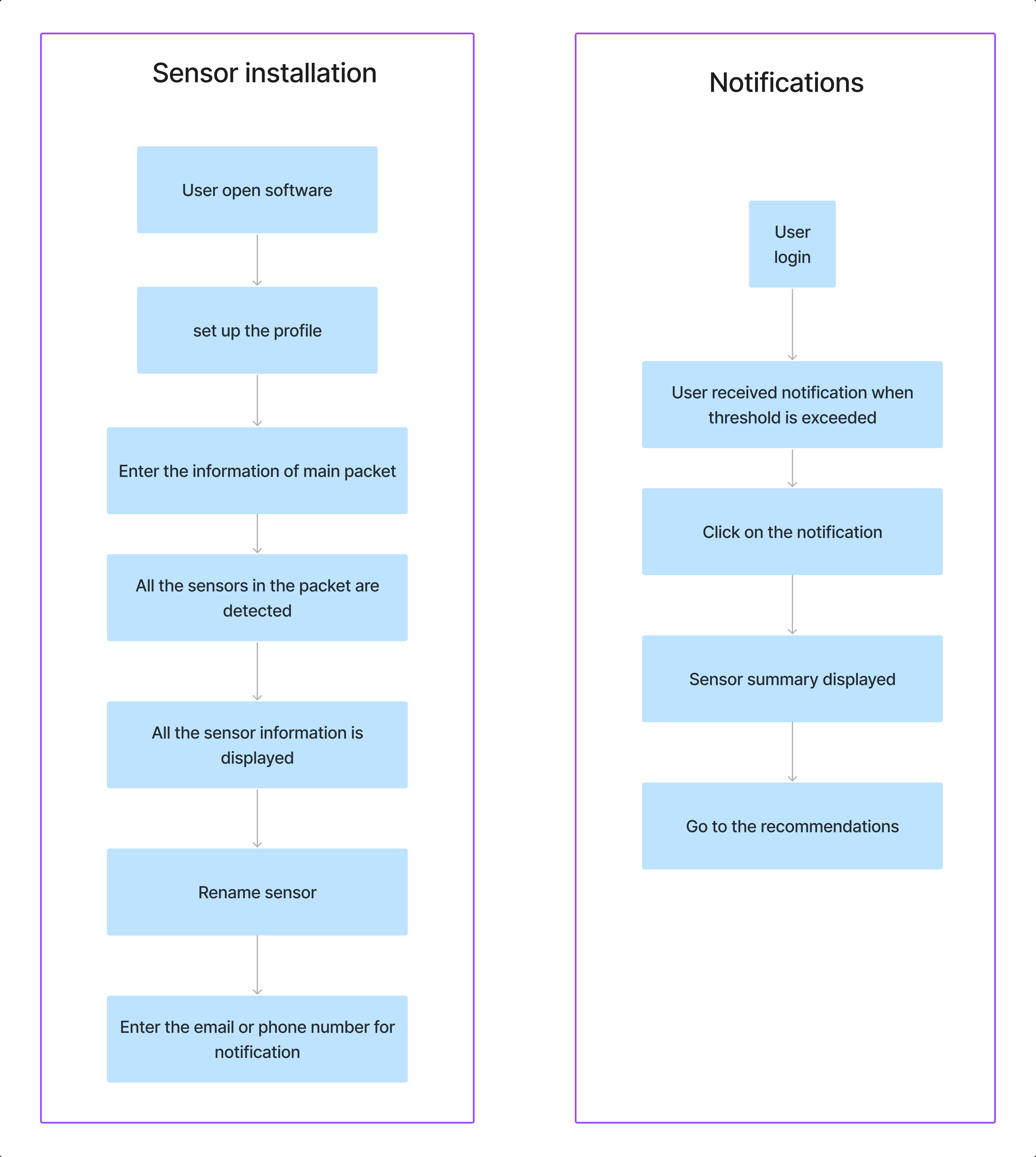
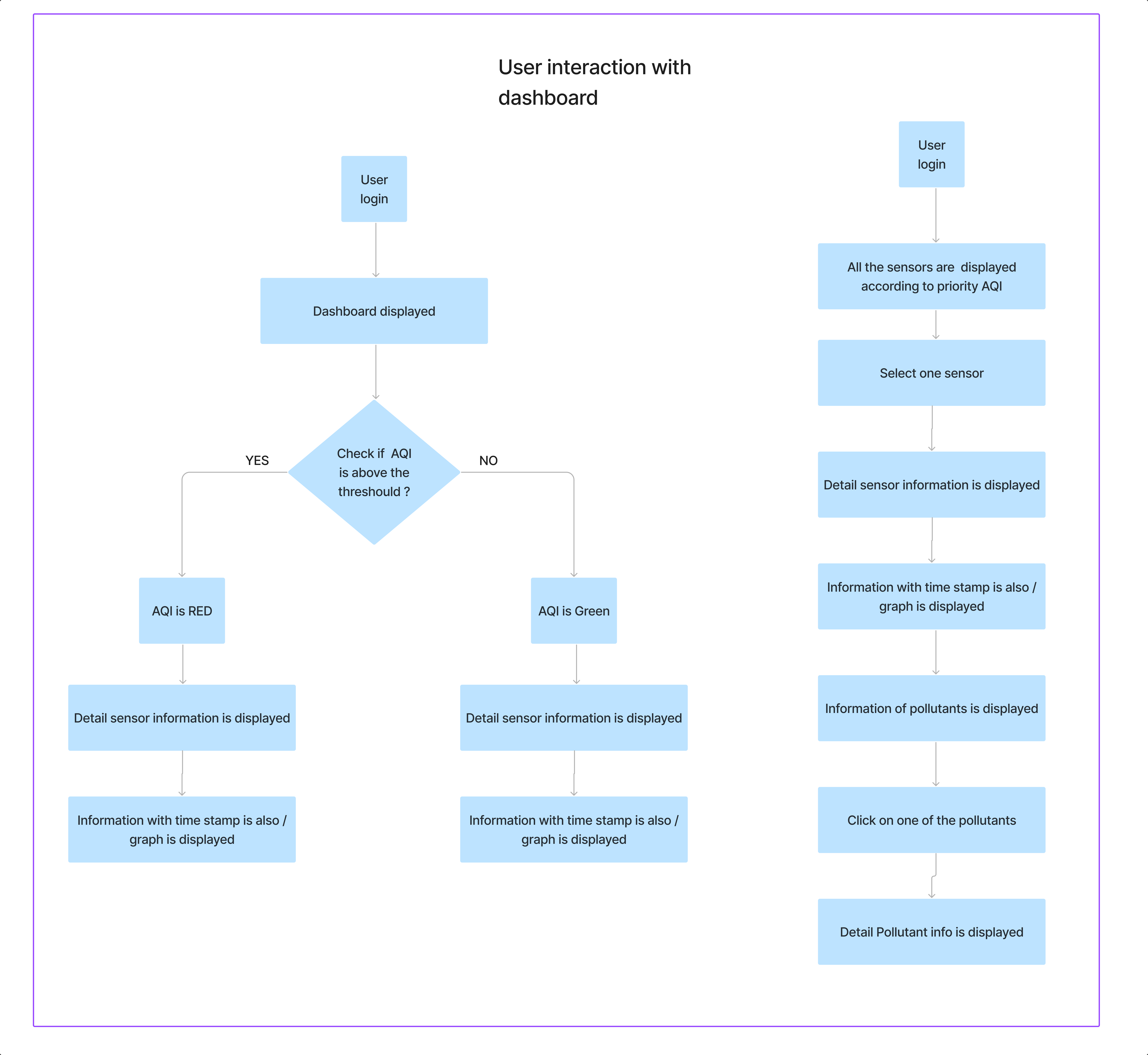
User Flow
With the research complete and the problem and solution clearly defined, I proceeded to create the user flow, which served as the skeleton to guide the screens that made up the prototype. The user flow is based on all of the logical steps that a user would take when trying to access AQI and recommendations. All possibilities were considered, although not all of them were incorporated into the prototype.
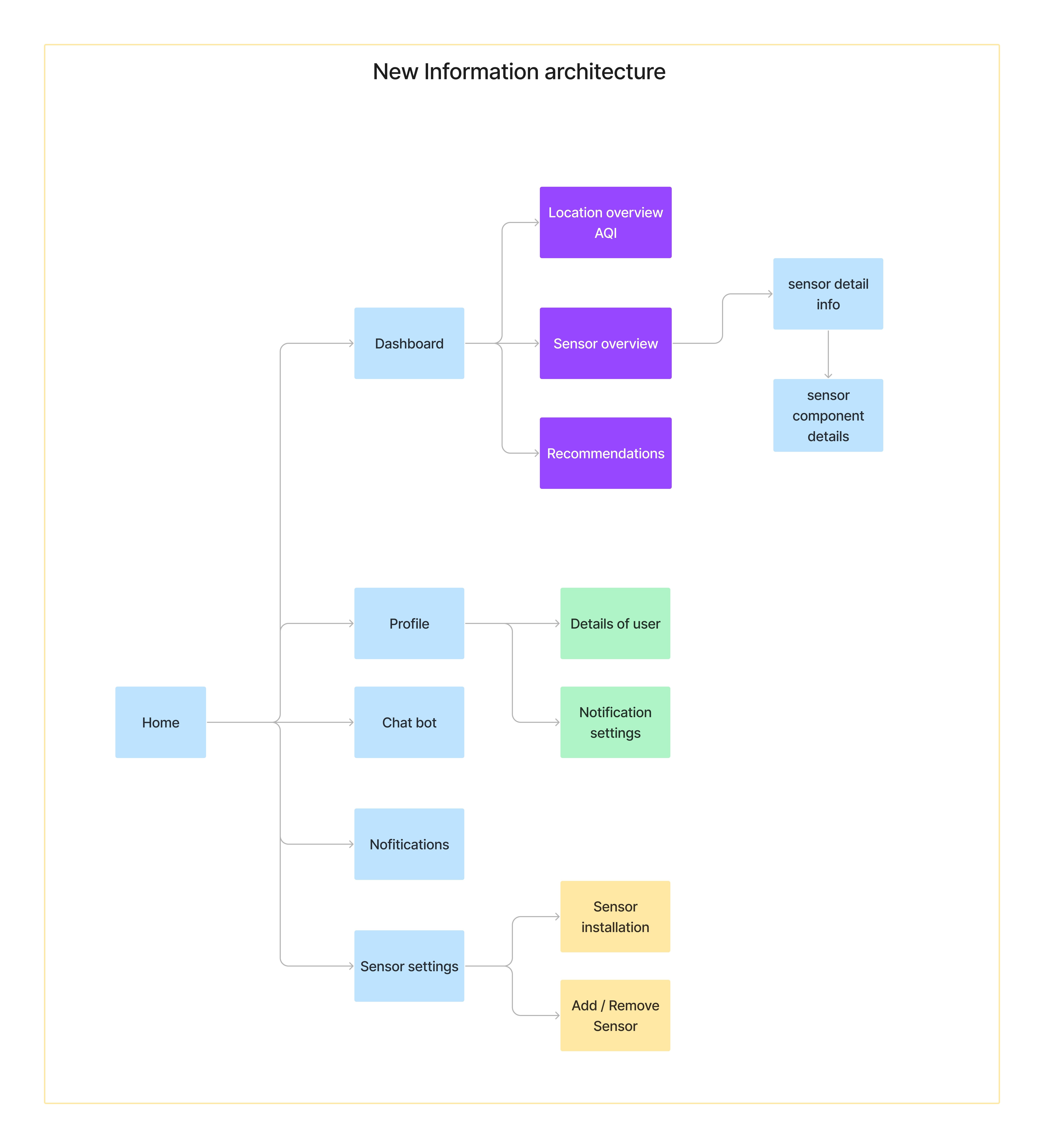
Information architecture
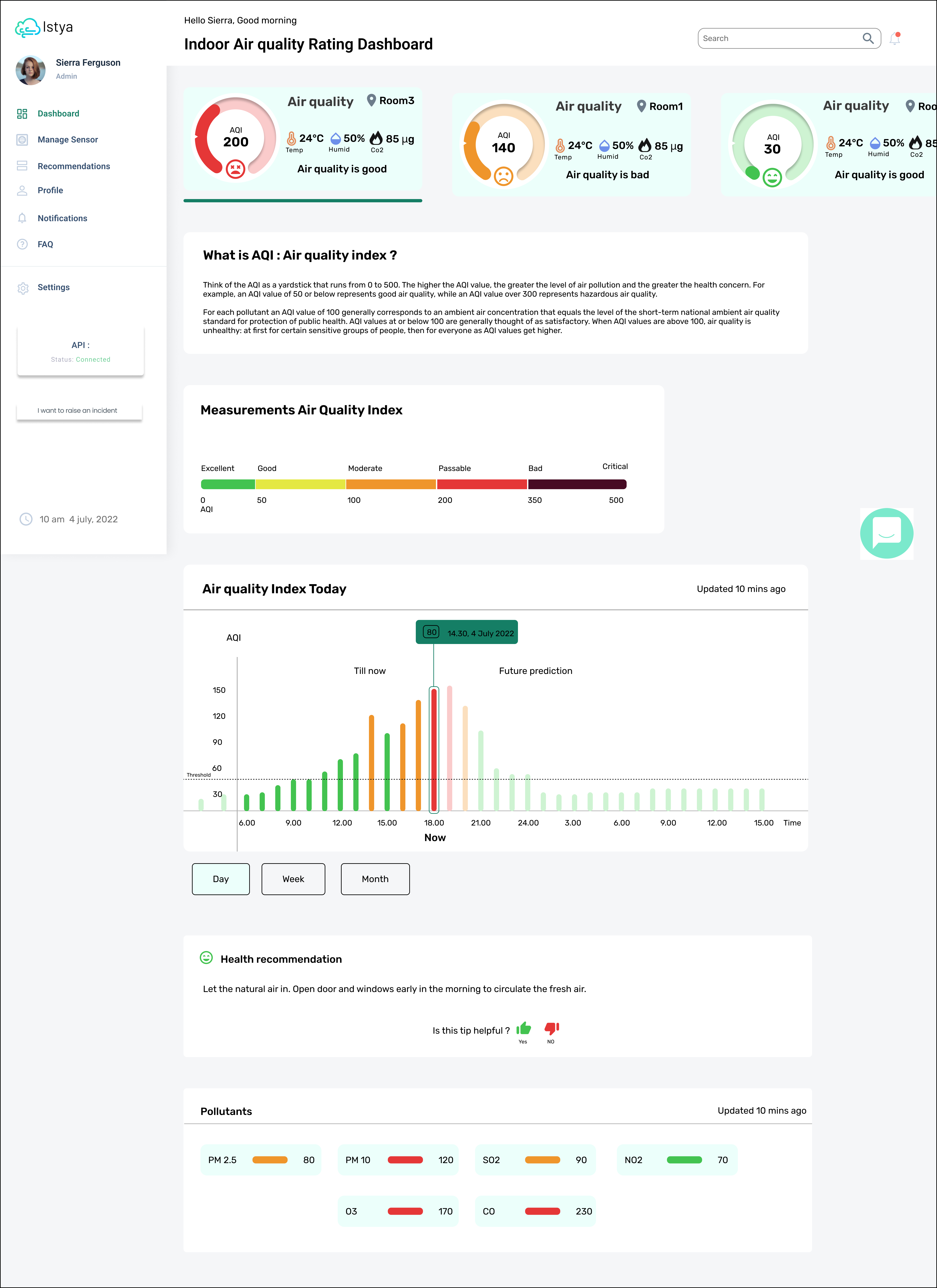
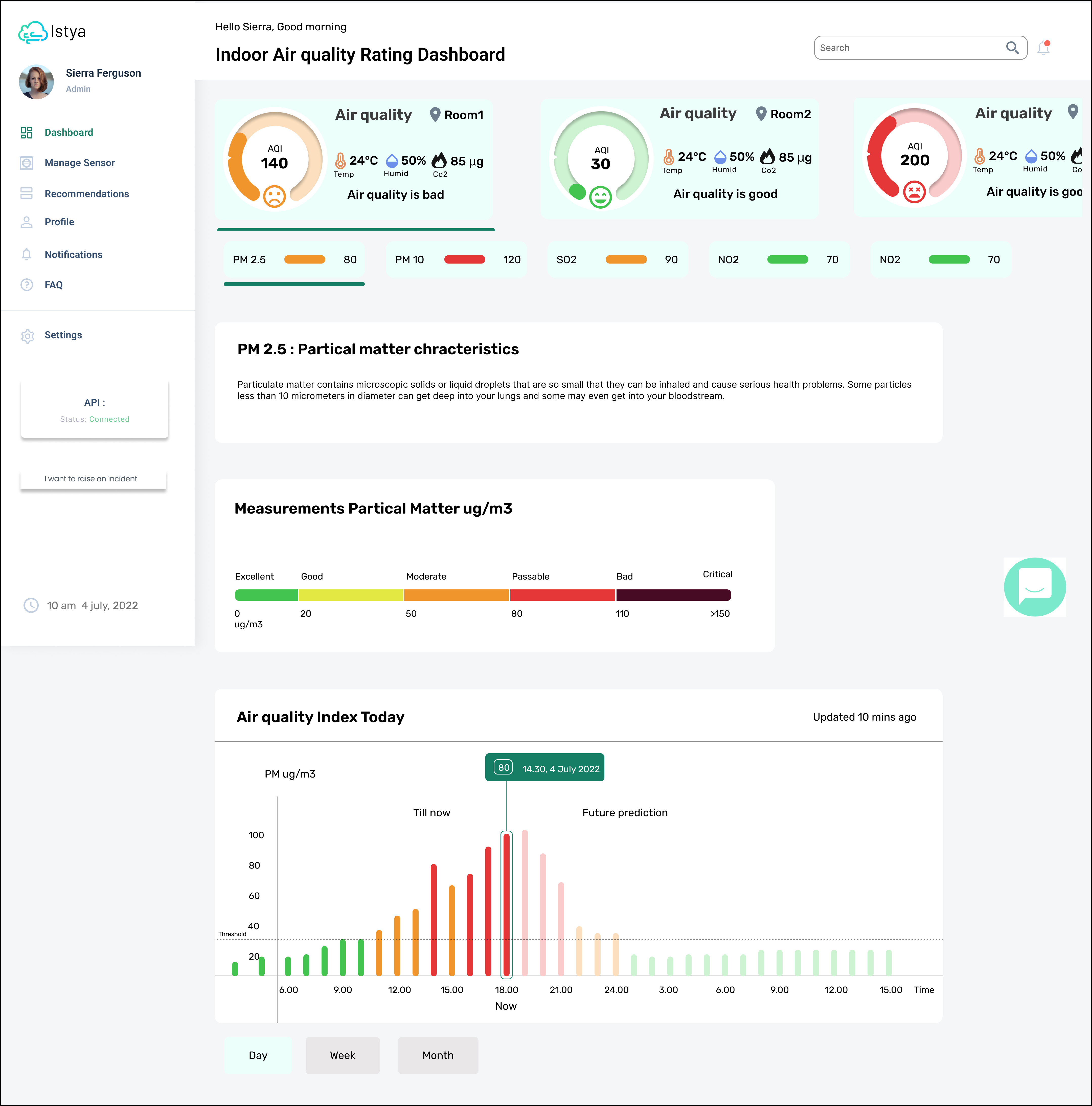
In this part, I decided to divide information into various levels such as,
Overview where priority is given to the location which has the highest AQI value and needs immediate attention
Details of AQI on various location
Details on pollutants for various locations
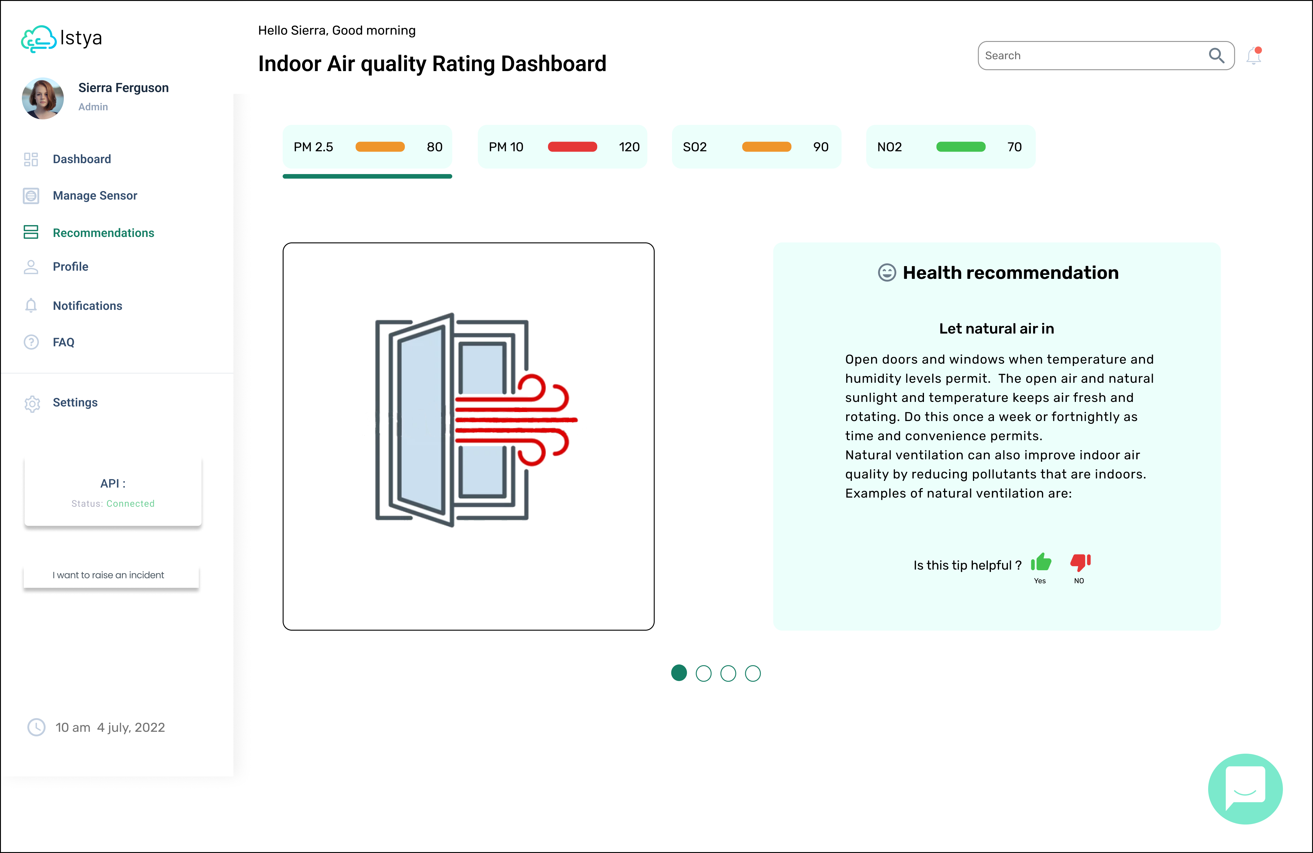
Recommendations for better indoor air quality
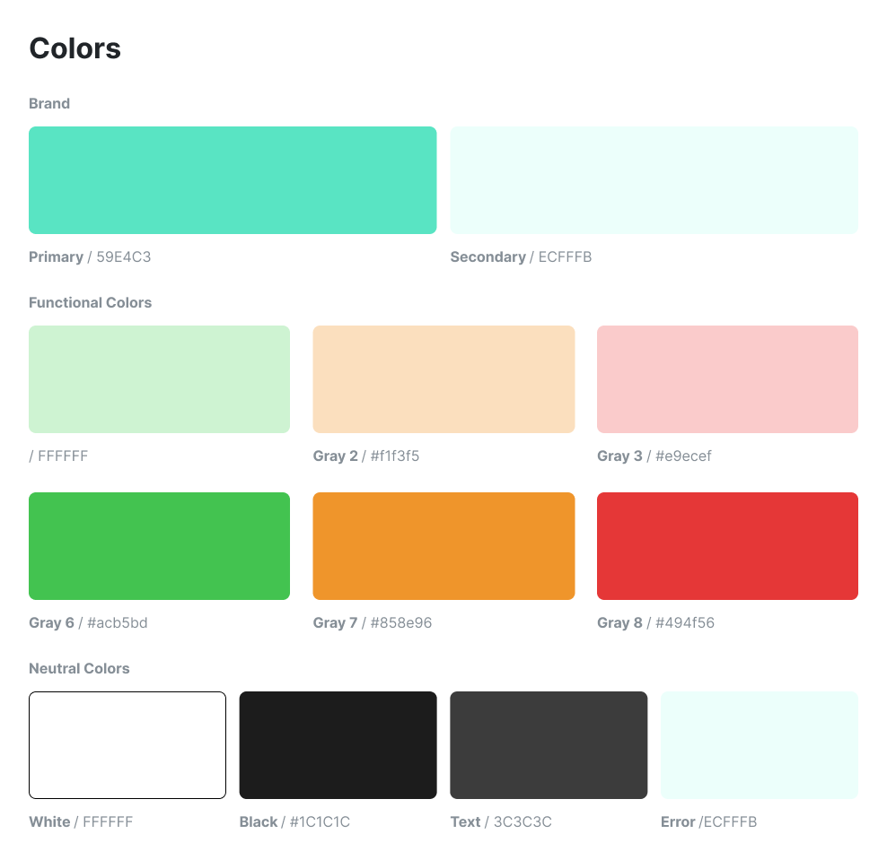
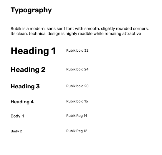
Style tile
I reused my client brand color but I’ve worked on their functional colors.
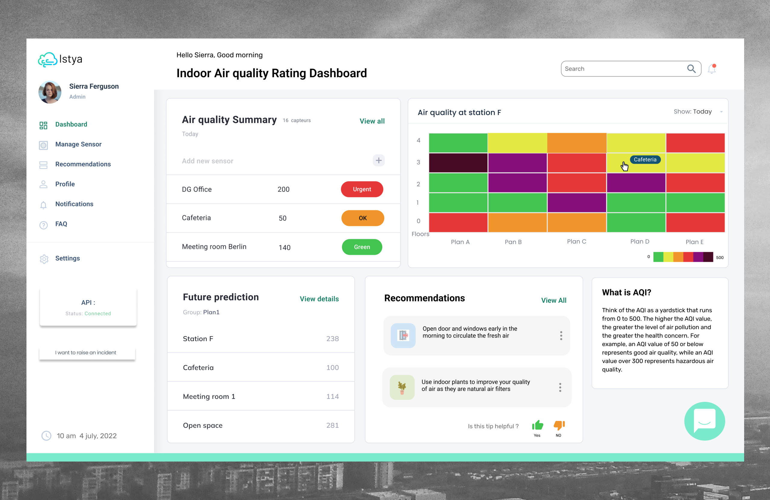
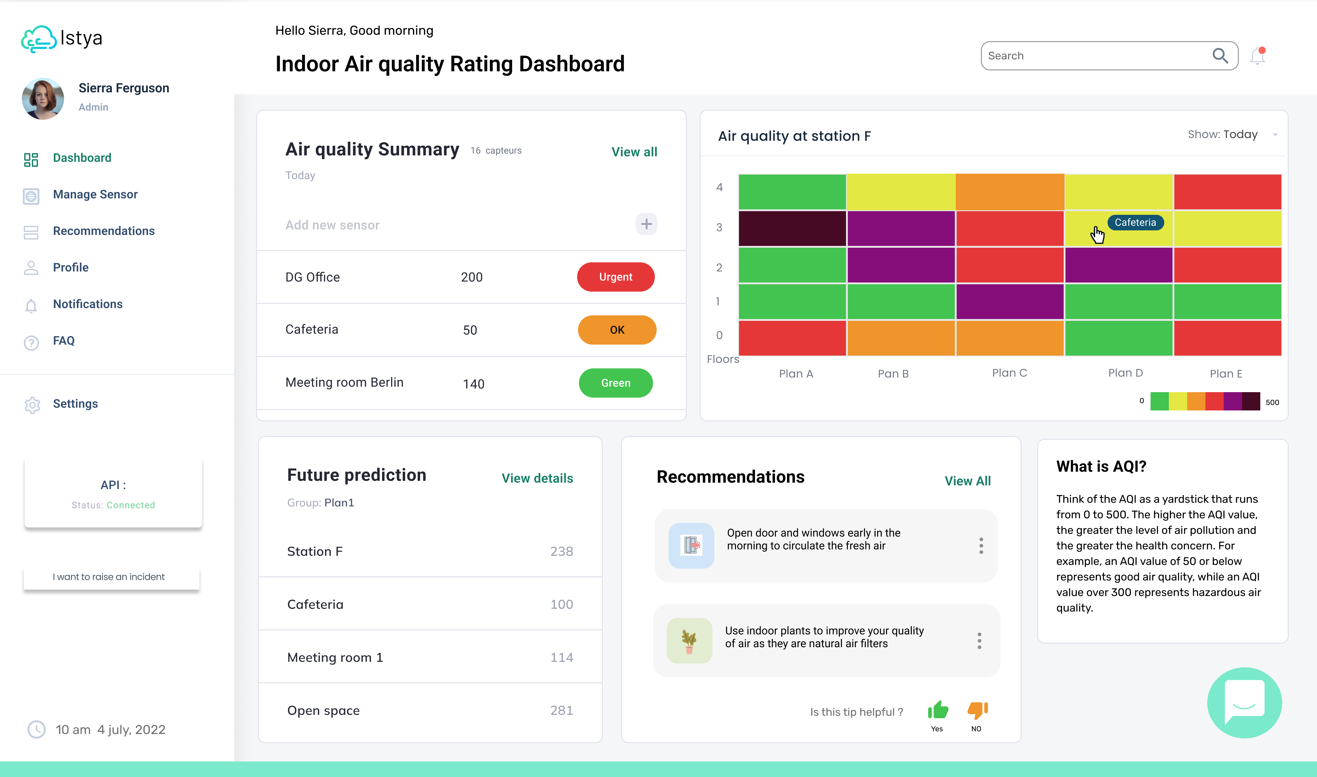
Final Design
Usability tests
Feedback from user testing for Air quality rating index KPI
What is this main KPI for?
Smiley is not very visible
Do not understand why 100 is given4
Too much text, do not understand where to focus
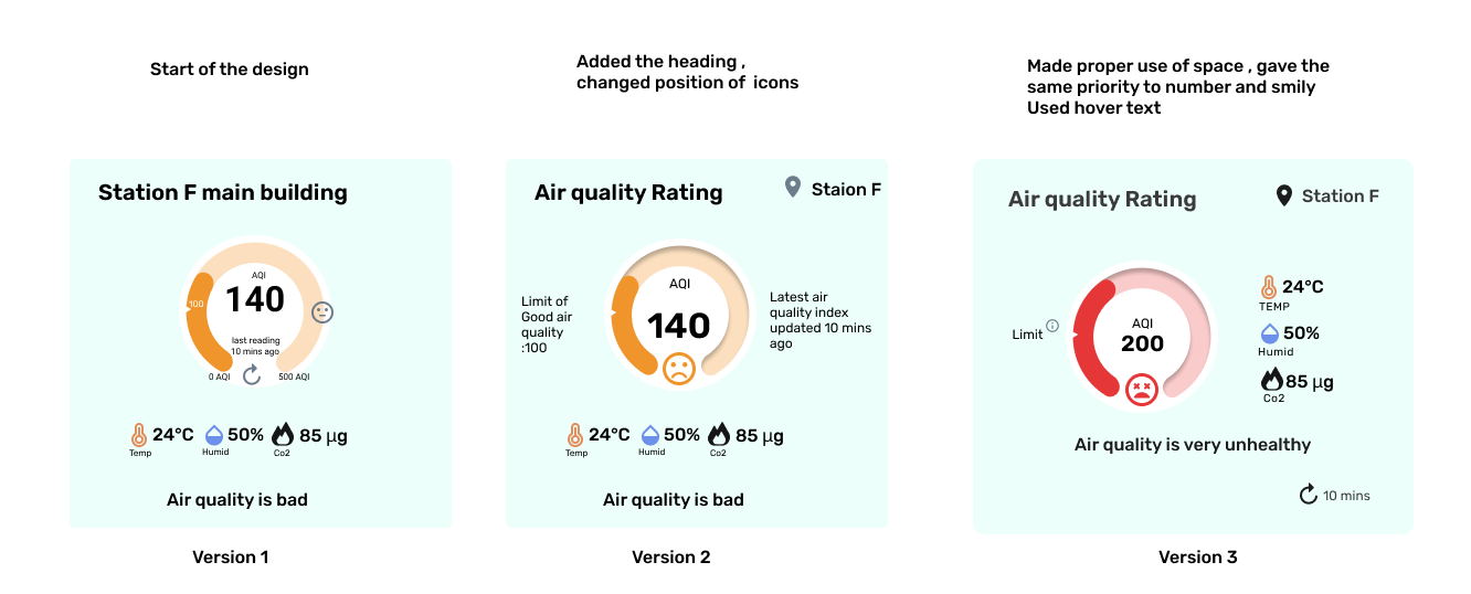
Design Iterations
After several usability testing (6 in total), I was able to tweak my mid-fi.
Users wanted to understand more the logic behind the AQI rating, so I added clear AQI ratings
To convey the air quality rating of the location I used smiley and text with the color. Overall, users enjoyed the minimalist way of presenting the information
Next steps
I still have some things I’d like to work on :
First, I’d like to build the rest of the pages: sensor installation, sensor list and sensor settings and do some usability testing for both desktop and mobile
Then, I’d love to work on the UX of mobile. Right now users have only access to the desktop software.
Finally, doing more usability testing on the final product.
Retrospective
Istya development team is currently in the implementation phase of my design
Working with a company like Istya reinforced the fact that I want to continue designing meaningful user experiences that have a true impact on our lives.
I believe that by providing solutions for those who wish to positively shape the world, we can create a community of change-makers, influencers and innovators. I desire to collaborate with responsible brands who believe that their company can be a force for the good of people and the Planet.
I believe in sustainable design. I believe that we can provide meaningful experiences to users while limiting our impact on the world. I believe that design is durable and useful and that it can serve good causes.
How simple design solution can solve big problems
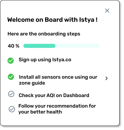
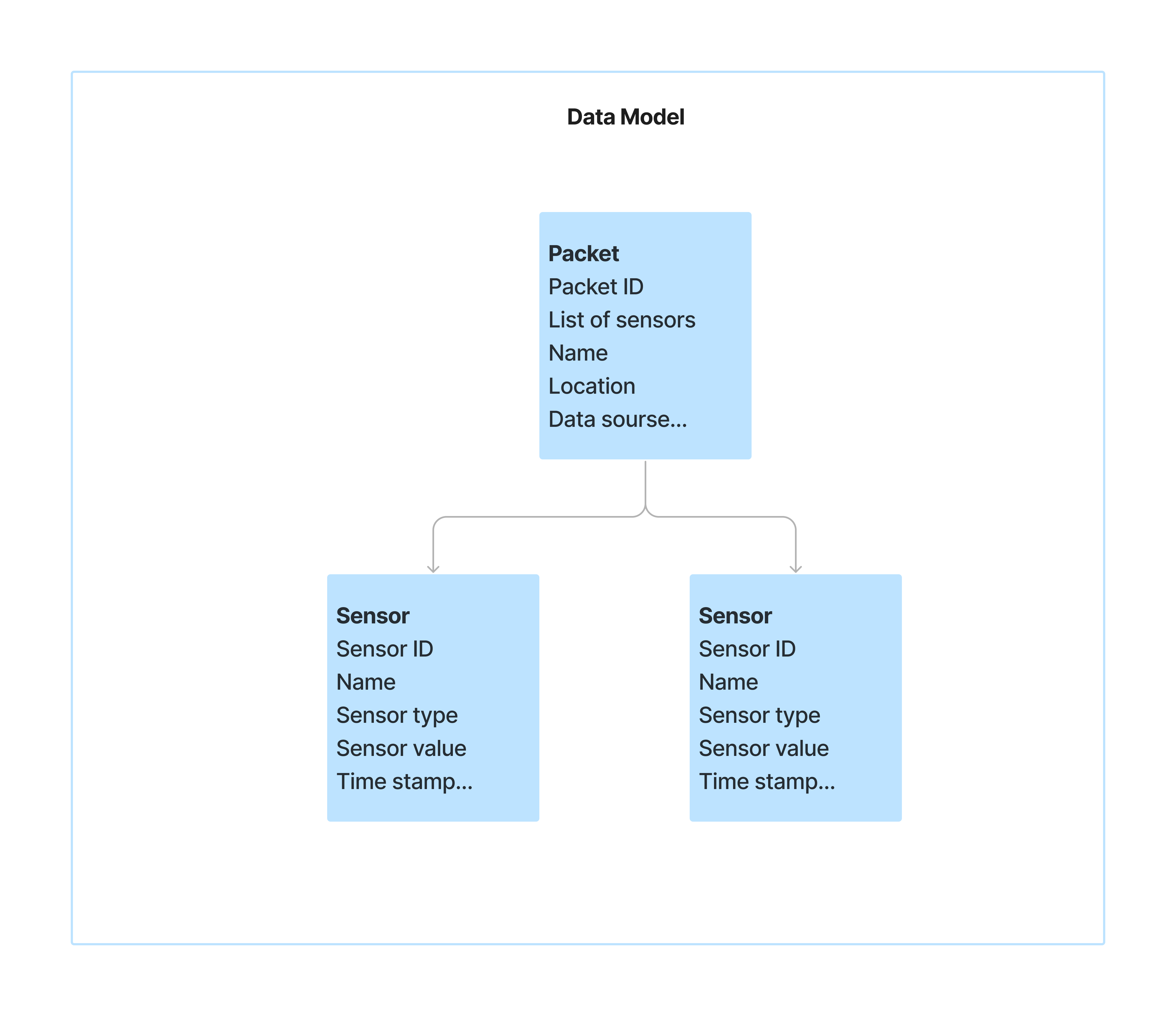
The first problem that I encountered during my interviews was, that the user has to install each sensor one by one
I came up with a simple one-to-many data model to solve this problem shown on the side
In this solution, the user has to add only that packet to install all the sensors at one time
I discuss this solution with the development team of Istya and they decided to use this solution 🙂